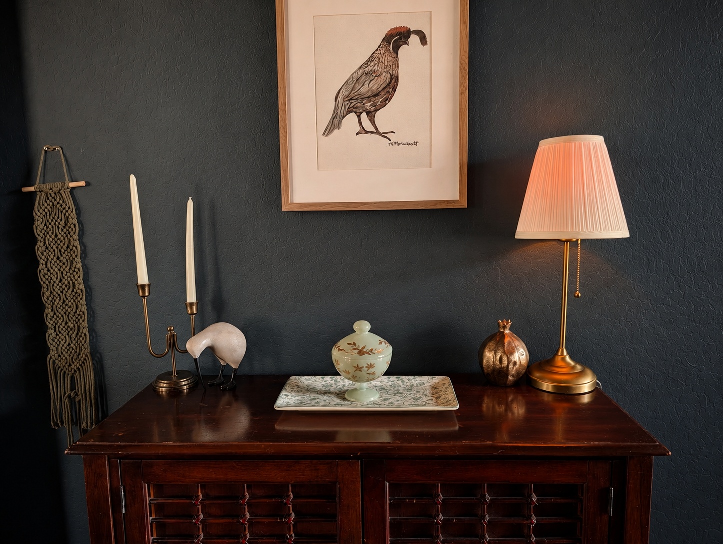
Let me hold your hand while I say this: moody colors are not scary.
I know they can look a little intimidating when you are staring at a tiny paint chip under fluorescent store lighting. Deep greens, muddy blues, burgundies and wine reds, chocolate browns, plums, and charcoals can feel like a very committed choice.
But I think that is also part of why darker colors are having such a moment right now.
After years of very light, very neutral interiors, it feels like people are ready for a little more personality again. Richer colors create atmosphere. They can feel comforting, intimate, elegant, and collected without automatically making a room gloomy.
And maybe most importantly, they make a home feel a little less like everyone else’s.
So if you have been flirting with a darker paint color but keep backing away from the sample card, here are a few worth looking at.
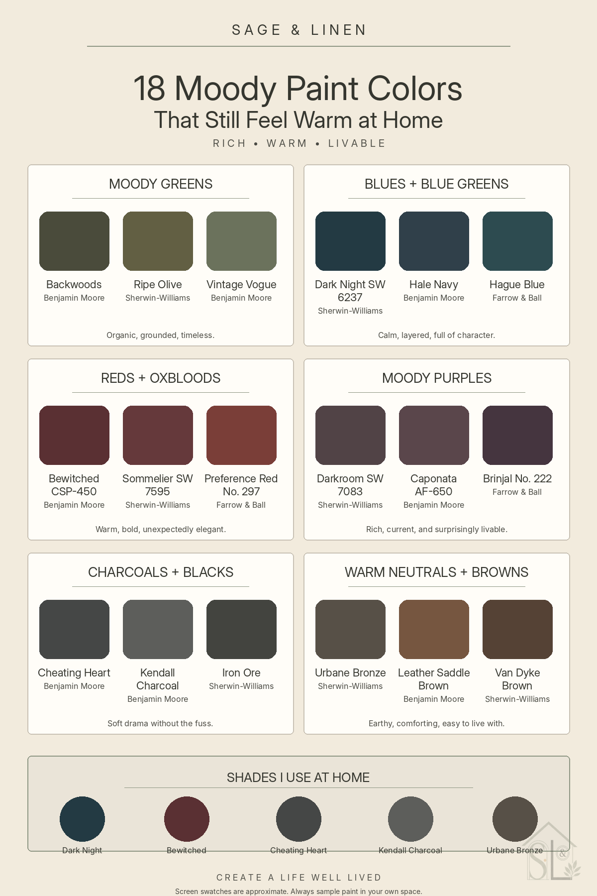
Moody Greens
Benjamin Moore Backwoods
A rich, timeless green that feels organic and grounded. It is beautiful with warm wood, brass, woven textures, and creamy neutrals.
Sherwin Williams Ripe Olive
Deep and earthy with that old library feeling I happen to love. This one would be gorgeous on cabinetry, built ins, or in a smaller room where you want some real depth.
Benjamin Moore Vintage Vogue
A dark forest green with a little vintage personality. Dramatic enough to make an impact, but still warm and familiar.
Moody Blues and Blue Greens
Sherwin Williams Dark Night SW 6237
This is one I actually use in my own home. It is a deep teal blue green that can read almost navy in certain light and much greener in others. It is dramatic, but it never feels cold to me.
Benjamin Moore Hale Navy
A muted navy with enough softness to keep it from feeling overly bright or nautical. A great option if you want something classic but still want plenty of depth.
Farrow & Ball Hague Blue
A deep, saturated blue with a green undertone. This is one of those colors that makes artwork, warm metals, and natural wood look especially good.
Moody Reds and Oxbloods
This is usually where people get nervous. Nobody wants to accidentally end up with a room that feels like a chain restaurant booth.
The trick is choosing reds with enough wine, brown, or depth behind them.
Benjamin Moore Bewitched CSP 450
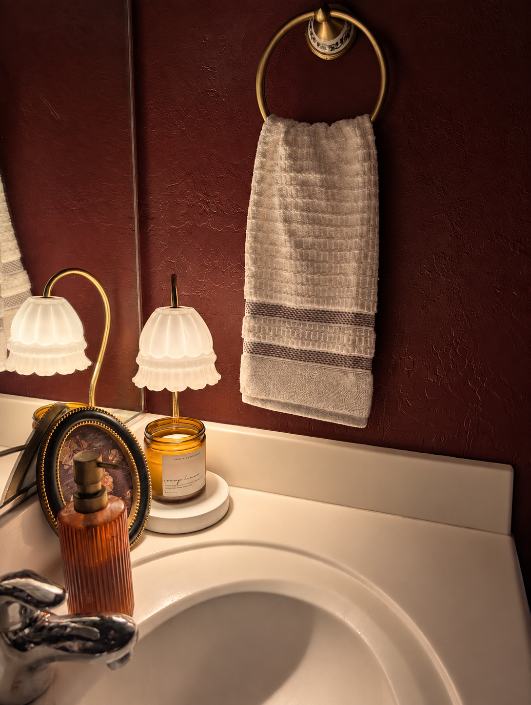
This is the deep oxblood shade I use in my bathroom. It feels much more like a rich wine red than a straightforward red and has a beautiful warmth under artificial lighting.
Sherwin Williams Sommelier SW 7595
A saturated wine red that feels grown up and dramatic without becoming bright. I could easily see this working in a dining room, powder room, or on cabinetry.
Farrow & Ball Preference Red No. 297
A deep, warm red with a traditional feel. It has enough richness to feel elegant rather than loud, especially paired with dark wood or aged brass.
Moody Purples
Purple is having a moment, and I am very much here for the darker versions of it.
Deep plum and aubergine can behave almost like brown or black, but with just enough color underneath to make things interesting.
I am text block. Click edit button to change this text. Lorem ipsum dolor sit amet, consectetur adipiscing elit. Ut elit tellus, luctus nec ullamcorper mattis, pulvinar dapibus leo.
Benjamin Moore Kendall Charcoal
I also have this upstairs on a bedroom door. It is a classic dark gray that feels grounded, flexible, and easy to live with.
If strong color still feels like a leap, charcoal is probably the easiest bridge into the moody side of things.
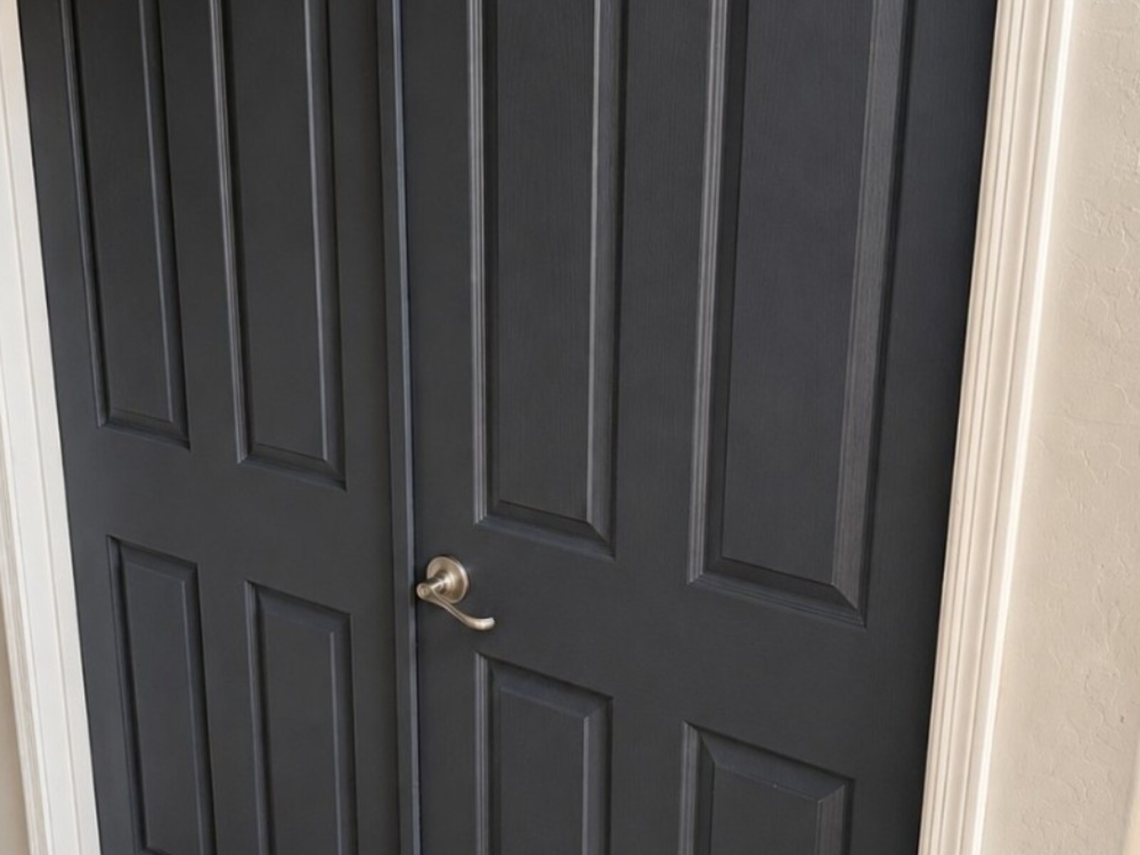
Benjamin Moore Cheating Heart
I use this on interior doors in my own home. It is deep and charcoal like without feeling as stark as a true black.
Moody Charcoals and Blacks
Farrow & Ball Brinjal No. 222
A beautiful aubergine with warmth and depth. This would be especially lovely in a small room with warm lighting and natural wood.
Benjamin Moore Caponata AF 650
A deep eggplant with enough brown in it to feel surprisingly grounded. Cozy, sophisticated, and nowhere near the bright purple you may be picturing.
Sherwin Williams Darkroom SW 7083
A black based plum that can read almost like a soft black in lower light, then reveal more of its purple side when the room brightens.
Sherwin Williams Iron Ore
A soft charcoal black with plenty of drama but less sharpness than a pure black. Beautiful on doors, cabinetry, trim, or an entire room.
Moody Warm Neutrals and Browns
Sherwin Williams Urbane Bronze
Another shade I use at home, this time on the entry door. It sits somewhere between bronze, brown, and deep gray and has a warmth that keeps it from feeling heavy.
Benjamin Moore Leather Saddle Brown
A rich reddish brown with a clay like quality. It feels warm, vintage, and particularly good next to creamy whites and natural materials.
Sherwin Williams Van Dyke Brown
A deep chocolate brown with a traditional feel. It would be beautiful on millwork, cabinetry, or anywhere you want depth without reaching for black.
Live With the Sample, Then Be Brave
I absolutely believe in sampling a dark color first. Put up a large sample and live with it for a few days. Look at it in the morning, afternoon, and evening and see what happens when your lamps come on.
But even after you have done all of that, those first few rolls of dark paint can still be scary.
The first coat can look patchy, harsh, and completely different from what you imagined. That is usually when the panic sets in.
My advice is simple. See it through. Trust the process.
Get two full coats on. Let the paint dry completely. Finish one full wall, one full door, or whatever complete surface you are working on, then stand back and decide.
You are not really seeing the color until you do.
And if you still hate it? That is what primer is for.
If Dark Color Still Feels Like Too Much
That is okay too.
You do not have to suddenly paint your ceiling burgundy because deeper color is trending. Maybe you start with an interior door, a vanity, built ins, the back of a bookcase, or one small room.
And maybe you decide you still prefer lighter walls.
The point is not to convince everyone to live inside a jewel box. It is simply to stop ruling out a beautiful color because it looks intimidating on a two inch paint chip.
See? I told you I’d hold your hand.
If you want to go a little deeper into why darker rooms work so well, read Moody Rooms: Rich Color, Depth, and Character.
