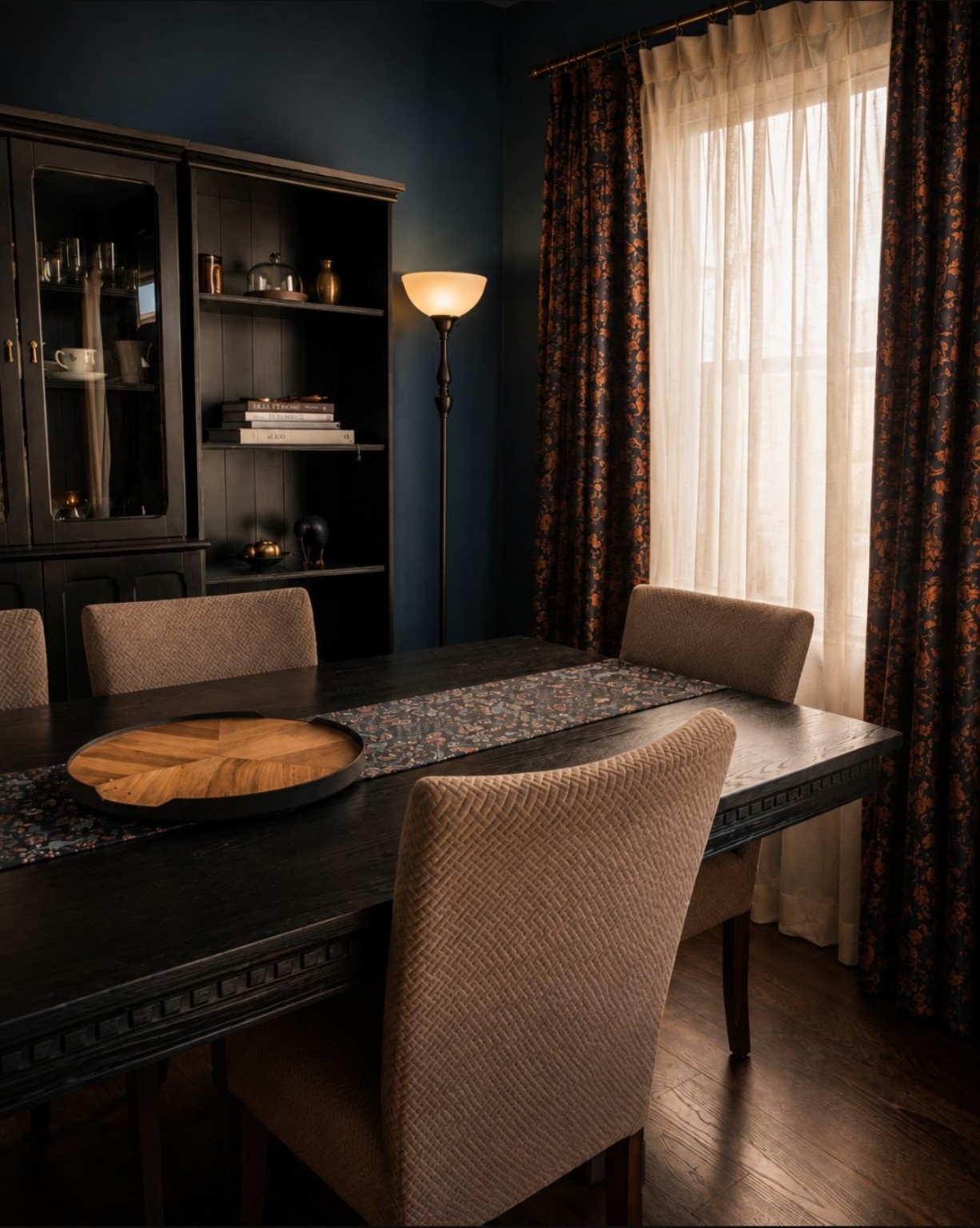
There’s just something about a moody room that gets me. Maybe it is the depth. Maybe it is the way deeper colors make a room feel a little more intimate and settled. Or maybe it is simply that I have never been particularly drawn to rooms that feel bright, white, and perfectly polished from one end to the other.
I like a room with some weight to it. A little drama. Warm wood, aged brass, deep paint, soft lighting, art that feels collected instead of coordinated. The kind of space that makes you want to stay awhile.
And lately, moody rooms seem to be everywhere. Color drenching, deep greens, oxblood reds, muddy blues, charcoal, chocolate brown. But for me, this is one of those trends that does not really feel like a trend. I have always leaned toward deeper, warmer colors in our home. Seeing them become more popular just makes it a little easier to find inspiration for something I already loved.
Dark Does Not Have to Mean Gloomy
I think this is probably the biggest hesitation people have with darker rooms. There is a fear that deep color will automatically make a space feel gloomy, heavy, or smaller.
It can, if everything else in the room is working against it. But dark paint on its own is not the problem.
In fact, one of the things I love most about a deeper wall color is how it can blur the edges of a room. Instead of your eye stopping at every corner, the color wraps around the space and creates a softer, more intimate feeling.
Our front room completely changed once we went darker. The color on the walls, Sherwin-Williams Dark Night (SW 6237), gave the room the depth it had been missing and made the artwork, wood tones, textiles, and warmer metals stand out in a way they simply did not against a lighter wall. Before, the room was fine. Afterward, it finally had some personality.
The room did not suddenly become gloomy. It became more interesting.
Color Drenching and Going All In
One of the reasons moody rooms are having such a moment is color drenching, where the walls, trim, doors, and sometimes even the ceiling are painted in the same color or variations of it.
It sounds like a lot when you describe it that way. Visually, though, it can actually feel calmer because there are fewer hard breaks between surfaces.
You absolutely do not have to color drench an entire room to get that effect. I think that is where social media can sometimes make design feel more complicated than it needs to be. You see a beautiful room painted floor to ceiling in burgundy and suddenly it seems as though you need to repaint every surface in your house to make it work.
You do not.
A single dark room, one saturated wall, painted interior doors, cabinetry, or even a deep entry color can give you plenty of that richness without committing the whole house to it.
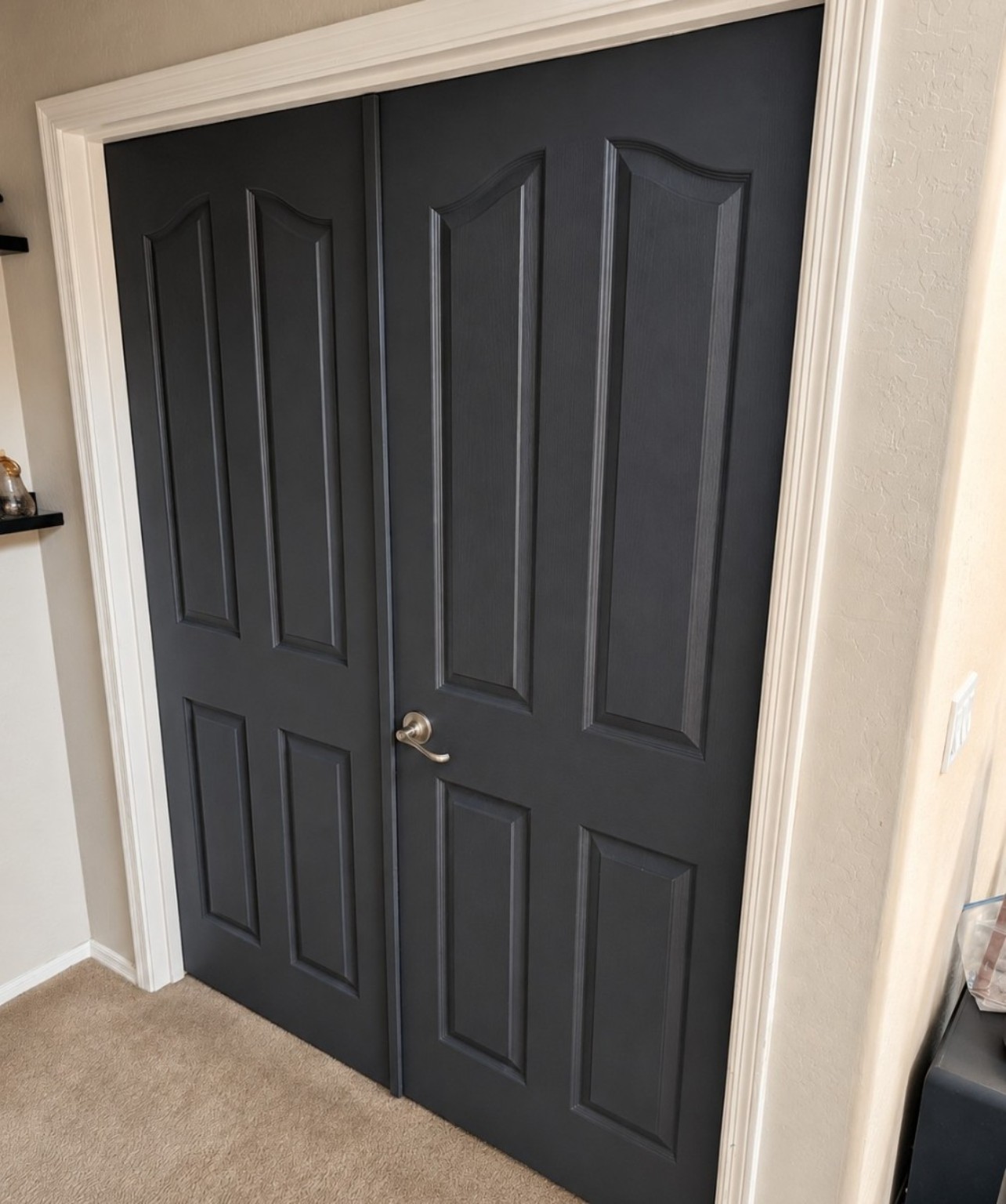
That is essentially how I have approached our own home. Dark Night in the front room. Benjamin Moore Bewitched CSP 450 in the bathroom, which reads as a deep oxblood. Benjamin Moore Cheating Heart on our interior doors. Sherwin Williams Urbane Bronze on the entry door.
They are not all the same color, and they are not supposed to be. What connects them is the depth and warmth.
Choosing a Moody Color That Still Feels Like You
There is no single moody color palette. That is part of what makes it so good.
If blue is your thing, look at navy, ink, midnight, and deep blue greens. If you lean warmer, oxblood, aubergine, rust, chocolate, and muddy browns can be beautiful. Greens can run from nearly black forest shades to softer olive and moss. Even neutrals can feel moody when they have enough depth.
The important part is choosing a color you actually like living with, not simply choosing the darkest paint chip because moody rooms happen to be popular right now.
I would also rather work with the light a room already has than fight it. If a room is naturally low light, painting it a stark white does not necessarily turn it into a bright sunny space. Sometimes it just gives you a dim white room. Leaning into the softer light with a richer color can make the room feel intentional instead.
That does not mean every dark room should be painted nearly black. It means the room gets to tell you a little bit about what it wants to be.
Contrast Keeps It Interesting
Deep color really comes alive when you give it something to play against.
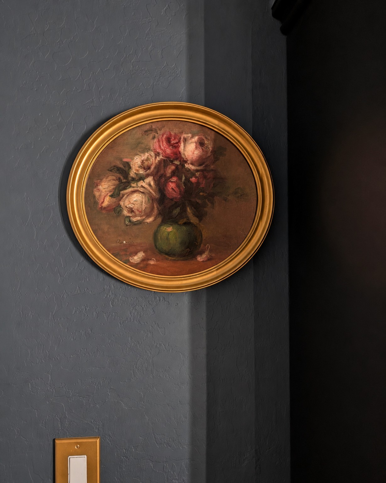
In our bathroom, the oxblood walls work because they are not the only thing your eye sees. The framed artwork has warm gold and brass tones. There are lighter details and reflective surfaces that catch the light. That contrast keeps the room from becoming one solid block of dark color.
The same thing happens in our front room. Dark Night gives the room its backdrop, but the warmer wood, art, fabrics, and metals are what make that backdrop feel layered.
This is one of the easiest ways to make a moody room feel collected rather than themed. Mix the deep paint with materials that have their own character. Wood grain. Linen. Velvet. Woven baskets. Old frames. Brass. Pottery. Books. Things that catch light differently and have some texture to them.
Lighting Matters More Than People Think
Lighting can completely change a dark paint color.
During the day, natural light may pull out undertones you barely notice at night. In the evening, lamps and warmer bulbs can make the exact same room feel softer and richer.
This is also why I would never choose a deep paint color based only on a tiny paint chip under store lighting. Put a sample in the actual room. Look at it in the morning, afternoon, and evening. Look at it with the lights on and off.
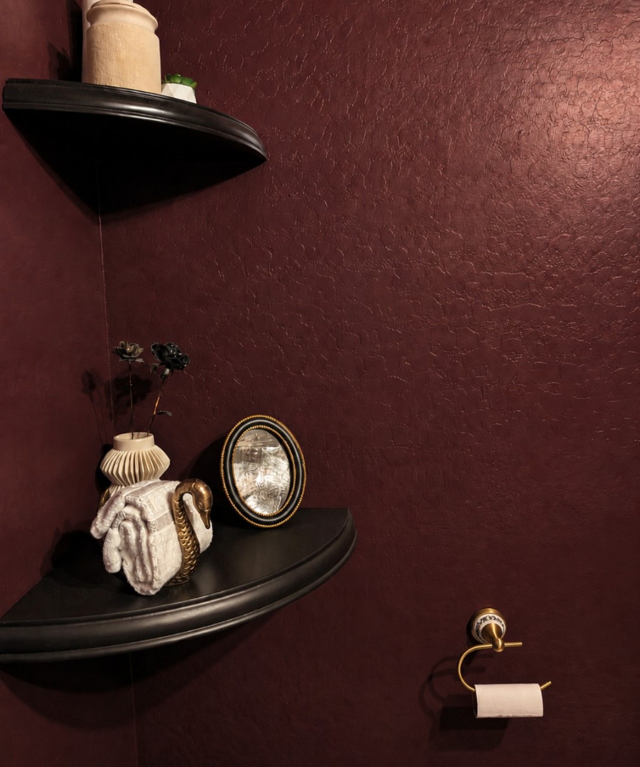
Our bathroom is probably the best example of how much lighting can change a dark paint color because there are no windows in that room at all. It is completely dependent on the lighting I put in there rather than natural light. The color on the walls, Benjamin Moore Bewitched (CSP-450), is a much richer, more complex oxblood in person than it can sometimes look in photographs, and the bulbs, fixtures, and warmth of the light make a huge difference in how that color reads. In a room like that, lighting is not just something you add after choosing the paint. It becomes part of the color itself.
And once the paint is right, I almost always prefer several softer light sources over relying entirely on one bright overhead fixture. Lamps, sconces, small portable lights, and even candlelight can add another layer to a room without adding another single decorative object.
Texture Does a Lot of the Heavy Lifting
Paint gets most of the attention in a moody room, but texture is what keeps it from falling flat.
A dark wall beside smooth furniture and nothing else can feel severe. Add a soft throw, linen curtains, a worn wood table, a vintage frame, a patterned rug, or a stack of old books and suddenly the same paint feels completely different.
This is probably why I am so drawn to moody spaces in the first place. They work beautifully with the things I already love. Warm woods. Collected pieces. Slightly imperfect finishes. Textiles that look comfortable enough to actually use.
Nothing has to match perfectly. Honestly, I think it is better when it does not.
A Moody Room Should Still Feel Like You
One thing I never want to lose sight of with moody interiors is that the goal is not to make your home fit neatly into whatever aesthetic happens to be having a moment.
Dark academia, whimsigoth, gothic, cottagecore, maximalism — there are so many beautifully defined styles everywhere right now, and if one of them genuinely feels like you, then absolutely lean all the way into it.
But you also do not have to.
For me, the point of a moody room is not creating a space that checks all the boxes of a particular aesthetic. It is creating a room that feels like the people who actually live there.
I still want family photos, books we really read, things the kids have brought home, furniture we actually sit on, and all of those slightly imperfect pieces that have accumulated over time. I want deeper color and atmosphere, but I also want the room to feel unmistakably ours.
The aesthetic you are fitting should always be your own.
So if you have been tempted by deeper color but have been afraid it will make your home feel too dark, start somewhere that feels manageable. A bathroom. An office. An entry. One interior door. Live with it for a while and see what happens.
You may find that instead of making the room feel smaller or gloomier, that little bit of depth gives everything else in the space more presence.
Because when you change the color of a room, you are not just changing how it looks. You’re changing how it feels to be there.
